57 kinds
Section catalogue
Every kind of section the content engine can render, drawn by the real renderer with sample data.
These words come from one file, in two languages
Everything you read inside these two elements lives in lib/i18n/voice-field.i18n.json. Two commands take it to an external model and bring the answer back — the same pair works for any dictionary in DICTS.
npm run i18n:export -- voice-field --langs es,fr,de,it,pt,pl,tr,nlnpm run i18n:import -- voice-field <файл-ответа.json>lib/i18n/voice-field.i18n.json
When to use it: Section heading. It also builds the table of contents and the anchor.
A section heading
When to use it: Sub-heading inside a section. It becomes the second level of the table of contents, nested under its own h2.
A sub-heading
When to use it: Fourth level — a topic inside a sub-heading. For documents that are genuinely three levels deep.
A fourth-level heading
When to use it: Fifth and deepest level: a label for a short enumeration. Same size as body text, set apart by caps — a heading smaller than prose stops reading as a heading.
A fifth-level label
When to use it: Ordinary prose. Supports **bold** and [links](https://example.com).
A paragraph carries the argument. Inline markup is limited on purpose: bold for emphasis and a link — anything richer belongs in a block of its own, where the renderer can be held to a contract.
When to use it: Somebody else’s words. `cite` names the author; the optional `lead` is a headline-sized first line INSIDE the quote — a field rather than a second kind, so the drawing cannot drift.
“A quote is the one place where the text is not yours — so the block shows attribution, and the attribution is a separate field rather than a line of prose.”
The same block, with a lead“The lead is not a heading tag: inside a quotation it would announce a section that does not exist, both in the table of contents and in the machine twin. It is a first line that simply reads larger.”
When to use it: Unordered set: the order carries no meaning.
- Items that could be read in any order.
- Each one stands on its own.
- Inline markup works here too: bold.
When to use it: Ordered steps: the order IS the meaning.
- First the goal is set.
- Then the work is done.
- Then a machine checks it.
When to use it: An illustration. `media:<name>` takes it from the store, a path takes it from the project.
When to use it: Code or an ASCII diagram. Never reformatted, never highlighted.
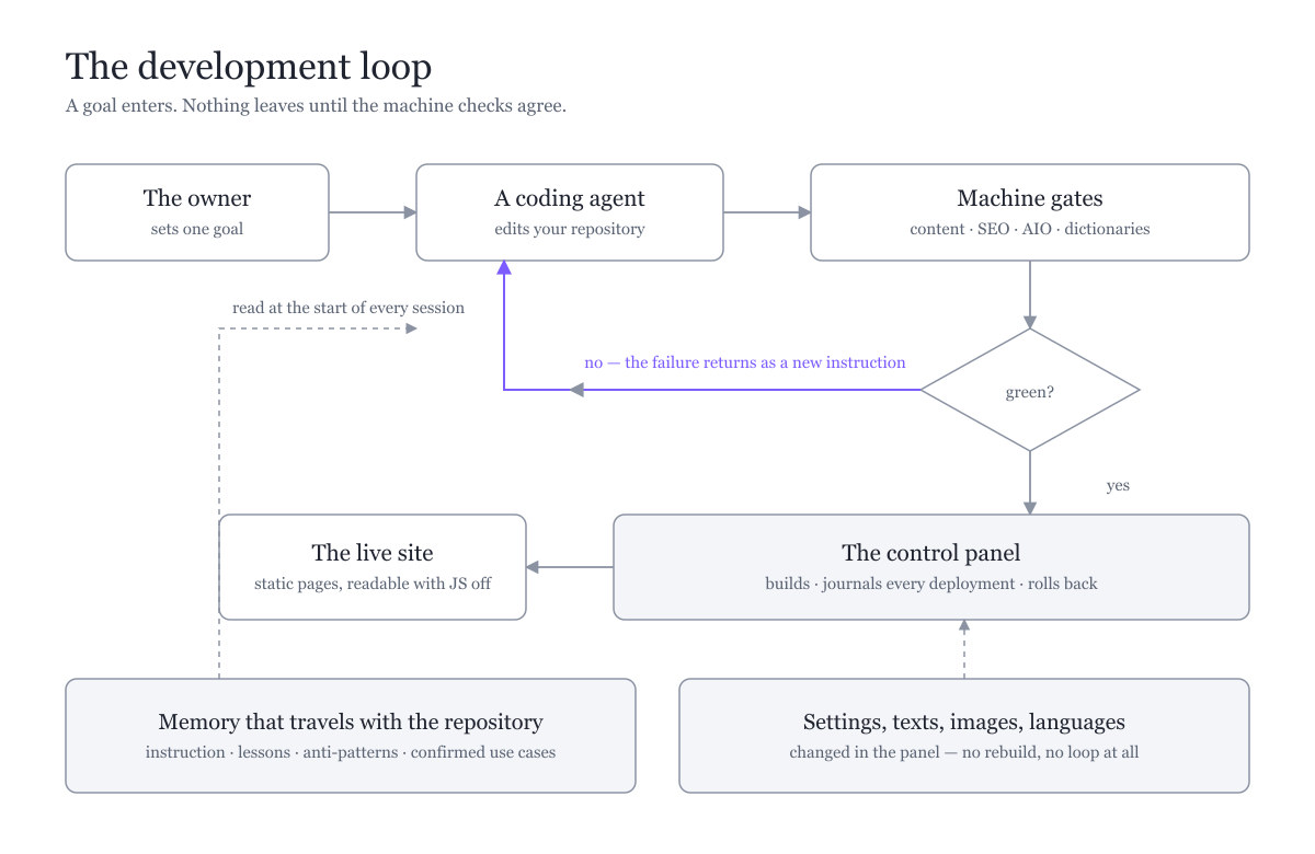
goal ──▶ agent ──▶ gates ──▶ green? ──▶ shipped
            ▲                  │
└────── failure ────┘When to use it: A footnote-weight remark: a source, a caveat.
A note sits below the argument and does not compete with it — quieter type, but still above the contrast threshold.
When to use it: An aside the reader should not miss. `title` is the lead-in.
When to use it: One action, one link. Inside a site the only legal form is the language root.
A call to action states what the reader gets, not what the button does.
Open the home pageWhen to use it: A comparison. The LAST column is emphasized as “ours”.
| By hand | In a loop | |
|---|---|---|
| Who repeats the work | a person | a machine |
| Who notices a mistake | a person, later | a gate, immediately |
| What scales | nothing | the verification |
When to use it: A card pointing at a full document, with a download button.
When to use it: A pull-quote in the owner’s voice. The byline comes from the settings.
A quote in the owner’s own voice, signed by whoever the project settings say the author is — never by a name typed into the content.
When to use it: Two or three columns on wide screens, stacked on a phone. Holds any blocks.
Left column
A container renders its children through the same registry, so anything nests inside anything.
Right column
- Including lists.
- Including another container.
When to use it: A plain vertical grouping — a column’s contents, or a semantic wrapper.
A group adds no decoration of its own. It exists so a container can hold a sequence where one block was expected.
When to use it: The project mark and the eyebrow above the H1. The mark comes from settings, never from content; the H1 itself is drawn by the page factory.
When to use it: A landing page's first screen: the words on the left, the illustration on the right. The ONLY section that carries the H1 itself — the page using it declares `titleInBody`, so the factory does not print a second one. The picture names a SETTINGS SLOT, not a file: every project has its own and it changes in the panel without a rebuild.
 Eyebrow above the title
The headline of a landing page
The paragraph that earns the visit — long enough to say what the product is and why it matters, short enough to read before scrolling.

When to use it: The OUTRO section: the last thing on a page, always full width, never governed by the width toggle. A marquee of all 82 languages — flag plus the name in that language — read straight from config/translations/language-metadata.ts, never from page data. Movement is pure CSS: it works with JavaScript off and stops for prefers-reduced-motion.
Eighty-two languages, ready before you need them
Every one of them ships with the product.
- English
- Français
- Español
- Português
- Deutsch
- Italiano
- Nederlands
- Svenska
- Norsk
- Dansk
- Suomi
- Íslenska
- Ελληνικά
- Polski
- Čeština
- Slovenčina
- Magyar
- Română
- Hrvatski
- Slovenščina
- Eesti
- Latviešu
- Lietuvių
- Malti
- Català
- Galego
- Cymraeg
- Gaeilge
- Euskera
- Русский
- Українська
- Беларуская
- Български
- Српски
- Bosanski
- Македонски
- Shqip
- Қазақша
- Oʻzbekcha
- Кыргызча
- Тоҷикӣ
- Türkmençe
- Azərbaycan
- Հայերեն
- ქართული
- Монгол
- العربية
- Türkçe
- עברית
- فارسی
- Kurdî
- Afrikaans
- Kiswahili
- Hausa
- Yorùbá
- Igbo
- አማርኛ
- isiZulu
- isiXhosa
- Kinyarwanda
- Soomaali
- 中文
- 日本語
- 한국어
- हिन्दी
- اردو
- বাংলা
- తెలుగు
- मराठी
- ಕನ್ನಡ
- ગુજરાતી
- മലയാളം
- தமிழ்
- नेपाली
- Tiếng Việt
- ไทย
- Bahasa Indonesia
- Bahasa Melayu
- Tagalog
- မြန်မာဘာသာ
- ភាសាខ្មែរ
- ລາວ
When to use it: A marquee of the 22 project directions a customer can build — landing page, store, company brain. Read from config/project-types.ts and its corpus, never from page data, so it cannot drift from the catalogue the control panel offers. Right-to-left, pure CSS, 200px of blur at both edges; clicking a card pauses the belt and opens a reference dialog with no buttons at all. Title and note are optional and normally absent: the section sits directly under the hero, where a second heading argues with the H1.
When to use it: A row of capability labels. The tone is a MEANING group, not a colour.
When to use it: One row of measures: a number and the thing it measures. Semantically a description list, NOT a table — three independent value/label pairs carry no row-to-column relationship, and markup that promises one lies to whoever cannot see the page. `value` is machine-side and never translated; the label beside it is an ordinary page string.
- ×4
cheaper to build
- ×9
faster to launch
- ×100
more reliable in production
When to use it: A set of independent cases, read ONE at a time: the list on the left, the opened case on the right — what is required on top, why it works here underneath. Different from flow: flow has ORDER and shows every step at once; here there is no order, and each case has two sides that must sit one under the other so the lower one reads as the answer to the upper. Switching is pure CSS (radio + :checked in styles/globals.css) — every case ships in the server markup, so the crawler and a visitor without JavaScript get all of it, and no separate copy "for robots" is needed. Panels are stacked in ONE grid cell, so the height equals the longest case and the page never jumps while switching. Six cases maximum — that is how many rules the stylesheet carries.
Two sides of the same case
Pick a case on the left; the card shows what it demands and how this project answers it.
What is required
The upper half states what the situation asks of you — plainly, in the words of somebody living through it rather than of somebody selling a cure.
Why it works here
The lower half answers. It reads as a reply because it stands underneath: put the two side by side and the connection turns into a comparison.
What is required
Cases are independent — there is no first and no last. That is precisely why this is not a numbered list: numbering would promise an order that does not exist.
Why it works here
The list on the left is a group of radio buttons, so a keyboard walks the cases with arrow keys and a screen reader announces them without any help from us.
What is required
Cases differ in length, and a card that resizes on every switch makes the page jump under the cursor — the reader loses the place they were holding.
Why it works here
All panels live in one grid cell, so the section is as tall as the longest case and stays that way. Nothing moves except the text fading in.
When to use it: How something works, as steps that light up in turn with a spark running along the link between them. Order is the CONTENT here, not decoration — that is what separates it from an olist in a box. Movement is pure CSS (styles/globals.css): it works with JavaScript off and stands still for prefers-reduced-motion. The wording never dims — only the frame, the glow and the numbered node do, because text faded with opacity drops below the contrast threshold.
How it works
Three steps, and the third feeds the first: the loop is the product.
Stand the server up
An installer robot leaves you an operating system, a starter template, a control panel, storage and authorization — already wired together.
Work where you work
Sync with GitHub, clone onto your own machine, open your usual editor. The data keeps coming from your server; only the code runs locally.
Push, and it is live
A push starts a deployment on your own server, and the visitor sees the new version.
When to use it: A section of equal cards with NO order between them — the same strip as `flow`, minus the numbers, the link and the animation. The difference is meaning, not decoration: lighting cards up in turn would show a sequence that does not exist, and an untruth told by a good animation is the more convincing kind. Hence `<ul>`, not `<ol>`. The header (badge, heading, lead) is the SHARED `SectionHead`, identical to `flow` and `noBill`. Equal height comes from the grid, never from measuring.
Three things worth knowing
A lead paragraph under the heading — it says what the cards have in common. The badge above carries the RUBRIC, and its colour is decided by the section, not by the content: a rubric has no semantic group to take a colour from.
A card holds one self-contained statement. Read in any order they still make sense — that is the test for using this kind instead of `flow`.
The cards are the same height because the grid row is as tall as its tallest item and each card fills it. No script measures anything.
A card is a CONTAINER: it holds any blocks — a heading, a list, a paragraph — so one kind serves both three short statements and two long side-by-side panels.
When to use it: One cell of a `cards` section. A container: it holds any blocks. `tone` gives it a light gradient wash in the colour of its MEANING group — `data` for what you do, `access` for what is worth doing first — never "make it green". A cell with no tone is a plain border: a wash has to mean something, and a wash on every cell stops singling out anything.
Two cells, two meanings
What you do
- Order matters inside a cell.
- The cell holds any blocks.
What is worth doing first
- The same tone the panel warns with.
- Nothing is blocked by it.
When to use it: A large spaced-out claim — the thing a section exists to say. The SAME drawing as the owner's pull-quote, minus the byline, and that difference is substantive: `founder` is signed with a name and a photo from the settings, so it marks what a PERSON said. A product rule was said by nobody; signing it would attribute to the owner a sentence he never uttered. The drawing is shared (`sections/pull-quote.server.tsx`) so the two cannot drift apart.
And this is a product rule, not advice: while a single case is unconfirmed the panel keeps its alarm lit and the coding agent refuses to build.
When to use it: An invitation in a dashed frame: here is a place that is still EMPTY and can be taken. Not `cta` — that one is a solid button about a ready action, while the dashes say the opposite: nothing is here yet. The whole card is the link, so hitting it is as easy as missing it is hard. The drawing is shared with the request card standing on the footer placeholder pages (`lib/ui/dashed-card.ts`): there it is a BUTTON and opens a window, here it is a LINK and leads to an address — different natures, one look, one class in one file so the two cannot drift apart.
When to use it: The bills that will not arrive: the section is NAMED by an H2 on top, then a struck-through vendor with a badge saying what you stopped buying, then the conclusion as an H3. The vendor is a SEPARATE field because it is the one word never translated — merge it into the sentence and the renderer no longer knows what to strike; the badge beside it IS translated, because "a database" is what a person understands without knowing the name "Neon". The conclusion sits AFTER the list on purpose: the struck names are the evidence, the sentence is what follows from them. The strike runs 2px past each word through padding, never through blank characters typed into the data.
A fully independent space
The section header takes the same shape as `flow` and `cards` — heading centred, lead paragraph beneath it, same width. Three sections of one page, one anatomy.
you do not pay
Vercelhostingyou do not pay
Neondatabaseyou do not pay
Clerkauthorization
You pay nobody
You depend on nobody. The project is yours, end to end.
When to use it: A bordered section holding any blocks. Three tones: plain, warn, accent.
A plain panel
The sections of a landing page are all this one kind, differing by tone and contents.
Worth doing
Something that is not blocking, but is expensive to postpone.
The one place
Where the model works
The only glow on the page: highlighting everything highlights nothing.
When to use it: Questions and answers — the last content section of a page, and the only one search engines read as a pair of "term and definition". The heading is printed by the MECHANISM, not by the material: "Frequently asked questions" is already translated into ten languages in `lib/content/page-ui.ts`, so `title` is only for a page whose questions are about one thing rather than frequent. Inline markup is deliberately absent: the very same strings go into the `FAQPage` structured data, where asterisks and brackets would be printed to the search engine verbatim.
Frequently asked questions
- Why is this a catalogue kind rather than layout inside the page template?
- Because a page must have ONE source of markup. While the template drew this section itself, the catalogue promised to show what a page is made of and knew nothing about it — and a rule added to the kind never reached the page.
- Does the page now declare its questions differently?
- No. They still live in the `faq` field of the language cell, and the same field feeds the FAQPage markup for search. Only the drawing moved.
- Can two of these stand on one page?
- No. The anchor is fixed so that it can be linked to from outside, and two sections would produce the same id twice.
When to use it: The table of contents of a page. You never write it: the page factory builds `items` from the `h2` blocks of the body, using the SAME `headingId` the headings themselves print — two ways of turning a heading into an address drift apart on the first text with punctuation, and then the contents lead nowhere. Its own heading ("On this page") is a word of the mechanism and lives in `lib/content/page-ui.ts`. Written by hand, the list becomes a second copy of the headings that goes stale silently: the link keeps working while the word in it no longer matches.
When to use it: A text field that can be dictated — the first kind of the catalogue that TAKES something from a visitor instead of showing them something. One kind, two sizes: 'line' puts the microphone inside the frame of a single-line input, 'area' puts a full-width button under a text area. While recording, an equaliser bar appears below; when recording stops, the bar is REPLACED in the same place by the transcript, which the visitor edits before accepting. It has NO receiver, by the owner's decision of 2026-08-28: the text lives in the browser and disappears on reload, so this is not a contact form. Transcription needs HTTPS, a session and a server key; without them the field stays an ordinary input and says why the microphone is unavailable.
What should the assistant be called?
One word or two. Hold the microphone and say it.
The transcript lands in the field only after you accept it — a misheard word costs one correction, not a second dictation.
What is this project about?
A paragraph is fine. The button sits under the whole area, not inside it.
The same control in its long form: only the shape of the field and the place of the button differ.
When to use it: A working screen rather than a page to read: a menu on the left, content on the right. Dashboards and project tools are built from this — the layout is taken from the architect layer that already runs on it, not invented here. On a phone the left column becomes a drawer that opens to 90% of the width and closes on any click. Menu entries are links only when they carry an address; without one they are plain marks, because a dead link in a catalogue is worse than no link.
Languages
Which languages the site speaks. Enabling one later is a setting, not a rebuild of the way the site works.
Add one language at a time
Each language is its own set of prerendered pages. Adding them one by one keeps a build failure attributable to a single change.
A language costs pages, not speed
Serving a prerendered page is the same work regardless of how many languages exist beside it — but every language multiplies what has to be generated.
Saving is not applying
The language set lives in the environment file and is baked in at build time. Until the project is rebuilt, the site keeps serving the previous set.
Enabled languages
This is the part a project fills with whatever it needs: fields, a table, an island. The block gives the frame and the rules; the content is yours.
- English — the base language
- Russian — the owner’s translation
When to use it: The same kind with the optional top row of sections — the second case, and it is a FIELD rather than a second kind. The drawing is identical; only `tabs` appears. Two kinds would have drifted apart on the first theme change, exactly as a quote with a lead would have.
Blocks
The catalogue of what pages are built from. The type answers what to put here; the kind answers what draws it.
The catalogue is closed
A kind not declared in the set does not exist for the application, and the build refuses. That is the whole reason two pages of one site cannot drift apart.
Below the row goes whatever the section is about — here a catalogue, on a dashboard a chart, in a tool its own controls.
When to use it: A row of capability cards, each ending in a link. Differs from `cards` by drawing rather than by fields: the order inside is fixed — heading, rule, text, link — and the link is pushed to the bottom, so in a row of three the links sit on one line however uneven the text.
What the server brings
Three capabilities that arrive together, not one after another.
Orchestration
Several agent platforms share one context, so a task started in one continues in another.
Persistent memory
What the project already knows stays in context between sessions instead of being re-read every time.
One machine
Everything runs on the server you own. No cloud accounts to open, no per-token bill to watch.
When to use it: Two halves with pictures — the product shown from two sides. The first kind of the `product-demo` family, which stood empty. Exactly two: the form rests on balance, and a third cell turns the pair into a row, for which `cards` already exists.
Two sides of the same day
Writing
Open a tab and describe what is needed. No local environment to prepare first.
Shipping
One action moves the change to the address people visit. No pipeline to configure.
When to use it: A row of cards that name whose thing each one is. The first kind of the `showcase` family, which stood empty. The third line is what the kind exists for — without it the card is indistinguishable from `cards`; with it the row answers the question a showcase gets first: whose is this?
What is already connected
Coding agent
Writes, runs and fixes code in a terminal.
Anthropic
Browser agent
Keeps the whole project in context while working in a tab.
OpenAI
Local runner
Runs on the machine without sending anything outward.
in-house
When to use it: Slides the reader turns. NO auto-advance, deliberately different from the showcase it was taken from: motion that cannot be stopped takes away the right to finish reading. Turning is a radio input plus a CSS rule, so it works with JavaScript switched off, and every slide sits in the markup where a crawler sees it. Limit: ten slides.
Step by step
Each slide is one move; nothing advances on its own.
The server is born
A clean machine becomes a working contour without anyone configuring it by hand.
The project arrives
The repository is yours; the code travels to it and back with one action.
The change is live
What was edited appears at the address people visit.
When to use it: Plans with a period switch. Ported from an external block library, with its dead weight left behind: eight of its fields were declared and never rendered. Both prices sit in the markup and only one is shown — a crawler reads both, and the yearly price, the one people compare, exists for everyone rather than only for a browser running scripts. The switch is a radio input plus a CSS rule, not an island.
Simple pricing plans
Choose the plan that fits your needs. Start free and scale as you grow.
$0
$0
- Up to 5 components
- Community support
- Weekly updates
- 100MB storage
- Basic analytics
$20
$200
Per month
Per year
- Unlimited components
- Priority support
- Daily updates
- 10GB storage
- Advanced analytics
$80
$800
Per month
Per year
- Unlimited components
- Dedicated support
- Real-time updates
- Unlimited storage
- Custom integrations
When to use it: A wide band ruled top and bottom with the accent colour: heading, paragraph and a button on the left, an image on the right. Ported from the storefront. It takes the FULL WIDTH OF ITS CONTAINER and not a pixel more — the breakout trick it used to carry (`w-screen` plus a negative margin) was removed by the owner on 2026-08-30 because it broke the layout of the page around it. Where it belongs is part of the kind: the bottom of a page that is itself full-width. The band shares the page background — what separates it is the two rules and the width.
Your own white-label platform on Open Code
The sources are open. Fork the repository, raise your own instance and build products with AI — for yourself or as a business: deploying servers for clients and consulting alongside.

When to use it: A grid of capabilities: icon, heading, pill label, description. Ported from the storefront — two columns on a phone, three on a monitor, with row gaps deliberately wider than column gaps because nothing but distance separates one cell from the next. Differs from `badges`, which is the labels themselves: here a label is a mark INSIDE a capability that also has a heading, an icon and an explanation.
What comes with the server
Twelve things that are already there — not a roadmap.
- for everyone
Agents with memory
Ready to answer from what the project already knows, without an hour of setup first.
- for everyone
Voice input
Dictate into any field meant for speech; the rest keep the ordinary keyboard.
- for everyone
Sign-in out of the box
Email links and Google, with roles and sessions. Nothing to configure to start.
- for everyone
Database and storage
Rows and files on the machine you own, behind one door and one key.
- for everyone
Backups by parts
Six parts chosen one at a time: people restore one thing, not everything.
- for everyone
Your repository
The project travels to your GitHub and back with one action.
- for everyone
Static by default
Pages are built ahead of time, so a traffic spike costs nothing extra.
- for everyone
Products on one server
A landing page today, a scheduled watcher next week — neither can damage the other.
- for everyone
Many languages
Enabling one later is a setting, not a rebuild of the way the site works.
- advanced
Maps on your machine
Routes and distances computed on the server, so requests are not metered one by one.
- advanced
Communication channels
A two-way link with the project, not just the ability to send a message.
- advanced
Search by meaning
Next to the rows it describes: one backup, one access contour, one meaning of deletion.
When to use it: The showcase carousel, ported one-to-one from the storefront: auto-advance every five seconds with a 700ms crossfade, slides grouped in threes, arrows that shift a whole group, numbered circles that pause on click and show ‖, a progress line that follows the pause, a glow that appears once the image has loaded, lazy loading of the current and next group, and a pause when the section scrolls out of view. Colours come from the theme, not from the storefront palette. Every slide also sits in a hidden block for crawlers — the carousel reveals one at a time through script.
Step by step, how it works
Five seconds per slide; click a circle to hold it.
Your server
placeholder — image coming soon
Your repository
placeholder — image coming soon
Your address
placeholder — image coming soon
Your data
placeholder — image coming soon
Your server
Credentials — and it is ready
Your repository
The code is yours from day one
Your address
One action to publish
Your server
Credentials — and it is ready
Infrastructure right after purchase
A clean machine becomes a working contour: site, panel, agents, memory, database and storage, without anyone configuring them by hand.
Infrastructure right after purchase — Your server, Credentials — and it is ready
A clean machine becomes a working contour: site, panel, agents, memory, database and storage, without anyone configuring them by hand.
The project arrives in your GitHub — Your repository, The code is yours from day one
What travels there is the application; the cockpit stays on the server, which is why an editing mistake cannot break it.
The change is live — Your address, One action to publish
What was edited appears at the address people visit, without a pipeline to configure first.
Memory that survives the session — Your data, Four stores, one door
Rows, files, meaning-search and a graph of connections sit behind one key on the machine you own.
When to use it: Support tiers, ported from the storefront one to one: a row of three, each with a large amount and its period on one baseline, a sub-label, perks marked with a star and a button at the bottom. One tier carries a label ABOVE the card and is filled in — and the label is the only thing that makes it the highlighted one, so a tier cannot be singled out without saying what for. Below the row: a line of small print and a wide link to the people who already support the project. NOT a price list: a price obliges, a contribution does not, so the button leads to where contributions are taken rather than to a checkout.
Support Open Code agentic engineering
This project is built by one person. Many features are still ahead — and your support keeps the lights on.
If you have the means to help, your name appears on the «Sponsors» page of the project, here and on GitHub.
$1
/mo
Coffee tier — every dollar counts
Your name listed on the Sponsors page, here and on GitHub
A direct line to submit feature requests
$5
/mo
Supporter — fuel the roadmap
Access to the private sponsors-only group
Instructions to remove the white-label badge
$20
/mo
Champion — featured on the Sponsors page
Personal one-on-one access to the founder
Access to all VIP features and skills
Sign in first to become a sponsor.
Our sponsors
See everyone who supports the project →
When to use it: Two halves with the spotlight moving between them: the active one takes 7/10 of the width, its neighbour 3/10, and a bar under the heading counts the nine seconds down. Ported from the storefront. It differs from `splitPair` by BEHAVIOUR, not by drawing: take `splitPair` to show a product from two equal sides, take this one to set two things against each other so the reader looks at one at a time. Not a line of script: the movement is a CSS animation, the choice is a radio input, and clicking a half stops the spotlight on it for good.
Two halves of the same day
The spotlight moves on its own every nine seconds. Click a half and it stops there.
When to use it: A grid of platforms where the glow comes out of the SEAMS: the cells sit two pixels apart over a radial backdrop, so the lattice is brighter in the middle and fades at the edges — no borders, no shadows. Ported from the storefront. The cell count is a multiple of six: two columns on a phone, three on a monitor, and only a multiple of six fills both without a stub. Differs from `featureGrid`, which lists what the PRODUCT can do; this lists platforms that belong to OTHER COMPANIES — hence the company line and the small print about trademarks underneath.
Five agent platforms, one environment
No API keys, no local setup — all five run on your server with full terminal access and shared memory.
Claude Code
Writes, runs and fixes code in your terminal. The gold standard for AI-assisted development.
Anthropic
Codex
Browser-native coding agent. Full project context, no terminal required.
OpenAI
Gemini CLI
Long-context coding agent. Understands the whole project structure in one prompt.
Qwen Code
Open-source coding agent. No subscription lock-in — powerful and free.
Alibaba
Kimi Code
Context-first model for large codebases. Excellent for refactoring and architecture work.
Moonshot
LightRAG
Your company brain: persistent vector memory shared across all five platforms.
Fractera
* The project runs on your own subscriptions to these platforms — no additional fees or commissions are charged for their use. Connect one, several or all of them, at your own discretion.
When to use it: Two series stacked over a time series, with a range picker in the header. Take it when the question is HOW A TOTAL MOVED and what it was made of — the stack answers both at once. Not for shares of a whole at one moment: that is a pie. Data is optional; without it the view draws the sample, so the catalogue never shows an empty card.
When to use it: Bars over a time series with a switch in the header: two totals, one series drawn at a time. Take it when values are compared point by point and the exact height matters. Two series as bars over ninety days turn into noise — that is why the source switches instead of stacking.
When to use it: A line over a time series with the same header switch as the bars. Take it when the SHAPE of the movement matters — growth, dips, seasonality — rather than the height of a single value. Points are hidden on purpose: ninety-one dots read as a dotted line, not as a curve.
When to use it: A whole split into parts at ONE moment, with the share labels sitting on the sectors. Take it when the question is what the total is made of. Never for movement over time: a pie has no time axis, and two pies side by side are read as one picture, not as change.
When to use it: Several measures at once, each on its own axis around a circle, with two series laid over each other. Take it when the shape of a profile matters — where a thing is strong and where it sags — rather than exact values. Six axes is the ceiling: beyond it the labels collide.
When to use it: The same shares as a pie, but each one gets its own track: the bar is read against the track, so the absolute size shows as well as the ratio. Labels sit on the bars themselves and survive any palette, because they blend by luminosity.
When to use it: A short stack of bars whose point is the TOOLTIP: no indicator, no cursor highlight, and it is open from the first frame rather than waiting for a hover. Take it to show what a tooltip looks like, or on a page read from a phone, where hovering does not exist.
When to use it: Four layers around a centre: rings, a slowly turning sector and a core icon, with the four cards sitting in the corners from lg up. Take it when a product rests on exactly four independent pillars and you want them seen as ONE construction rather than as a list. The count is geometry, not taste — five cards have nowhere to sit and three leave a corner empty. Motion is optional by construction: the server prints the resting state and the animation arrives only after a pointer enters, on wide screens.
Security is built into the foundation
Four layers of protection — each one works on its own.
Made to fit the regulator
01Personal data stays where the law of your country requires it to stay — on your own server, under your own jurisdiction.
your country's lawYour data survives you
02Backups, moving to another server, export and import — the project is yours to carry away whole.
backups and movingMoney with no surprises
03Cloud AI costs and everything else stay on the server you own. Nothing bills you from somewhere else.
no surprisesYour own authorization
04The whole project is closed by authorization that belongs to you. Security is entirely in your hands.
your authorizationWhen to use it: A run of messages as a section of the page: the feed of the project chat tool, without an input field. Take it to show a conversation — with a person, with an assistant, with a bot. Six kinds of attachment fit under a message: audio, image, video and document, which the library recognises by media type, plus a place and a calendar event, which are ours. A working chat is put in place by a consumer that owns the state.
Chat
One implementation of a conversation for the whole project — and everything a message can carry.
Sending the voice note and the photo from the site.
Got both. The photo is shown as a preview, the voice note as a row — the library decides that by media type, not by us.
Here is the walkthrough and the offer.
And this is where we meet.
The place and the event are ours: the library has neither, and both are drawn in the same row shape so a message keeps one list of attachments rather than two.
Forwarded messages keep the line above the text — who wrote it, when, and where it came from.